
14 March 2017
Tim of Finland writes:
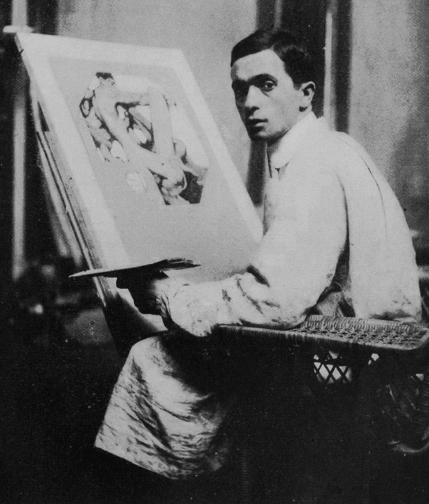
I am sure that most of Hear The Boat Sing’s American readers – and a majority of the rest – will know of the artist, Norman Rockwell. In a career that stretched from 1902 to 1976, he produced paintings and illustrations that (allegedly) reflected American life, especially in his covers for the widely circulated and influential magazine, The Saturday Evening Post. He was much-loved by Middle America but liberal critics dismissed his art as middlebrow, saccharine and idealised. Rockwell himself admitted that, ‘I paint life as I would like it to be’. Much less well known and little remembered is the man who inspired Rockwell, his self-proclaimed idol and primary mentor, Joseph Christian Leyendecker (pronounced Loin-decker).
Hunter Oatman-Stanford, writing in the online collectorsweekly.com in August 2012, said this about Leyendecker:
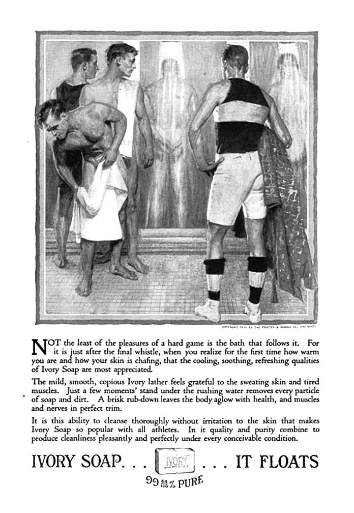
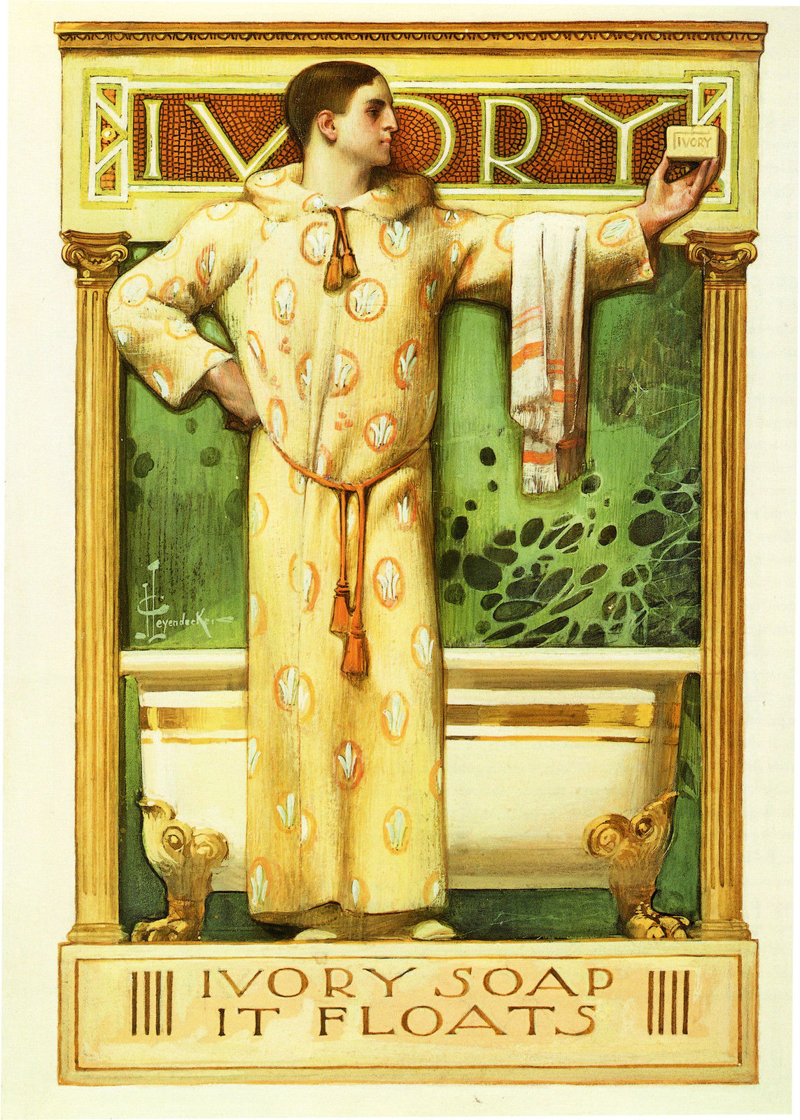
Nobody had to tell J.C. Leyendecker that sex sells. Before the conservative backlash of the mid-20th century, the American public celebrated his images of sleek muscle-men, whose glistening homo-eroticism adorned endless magazine covers. Yet Leyendecker’s name is almost forgotten, whitewashed over by Norman Rockwell’s legacy of tame, small-town Americana….. While Leyendecker was also known for his depictions of apple-cheeked children and elegant women, it was his stern, brooding men who created the greatest impact. With their strong jaws and perfectly tailored clothes, Leyendecker’s men were featured in the pages of newspapers and magazines across the globe, selling everything from luxury automobiles to socks. Leyendecker’s fictional world of affluence and beauty influenced other pop-culture touchstones, like the fantastic setting of F. Scott Fitzgerald’s “The Great Gatsby”.

In the notes for their 2010 exhibition, Norman Rockwell and His Mentor, J.C. Leyendecker, The American Illustrators Gallery wrote:
Rockwell virtually did everything possible to imitate Leyendecker….. He imitated (him) so completely the public became confused as to the source: Leyendecker or Rockwell? While Leyendecker received little adulation or credit for his truly iconic images, Rockwell took de facto credit for creating quintessential American icons…..Eventually, Rockwell replaced Leyendecker in America’s collective consciousness and took the crown as America’s greatest illustrator.
Amongst the things that Leyendecker created or popularised is the standard jolly, fat Santa Claus that we know so well, the giving of flowers on Mother’s Day, and the image of a baby with a sash to signify New Year.

While Rockwell was a family man with a small town taste and lifestyle, the sophisticated and hedonistic Leyendecker was, in his youth, quite the opposite – though his Wikipedia page (unlike the rest of the Internet) is strangely coy about his private life:
Many biographers have speculated on J. C. Leyendecker’s sexuality, often attributing the apparent homoerotic aesthetic of his work to a homosexual identity. Without question, [he] excelled at depicting male homosocial spaces – locker rooms, clubhouses, tailoring shops – and extraordinarily handsome young men in curious poses or exchanging glances. Moreover, Leyendecker never married, and he lived with another man, Charles Beach, for much of his adult life…
I suggest that the difference between Rockwell and Leyendecker is well illustrated by their respective depictions of the American Thanksgiving Holiday.
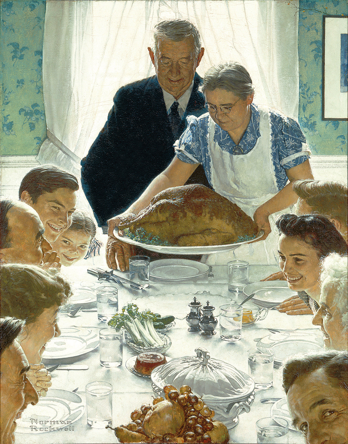
Freedom from Want’s Wikipedia page says that:
To art critic Robert Hughes, the painting represents the theme of family continuity, virtue, homeliness, and abundance without extravagance in a Puritan tone, as confirmed by the modest beverage choice of water. Historian Lizabeth Cohen says that by depicting this freedom as a celebration in the private family home rather than a worker with a job or a government protecting the hungry and homeless, Rockwell suggests that ensuring this freedom was not as much a government responsibility as something born from participation in the mass consumer economy.
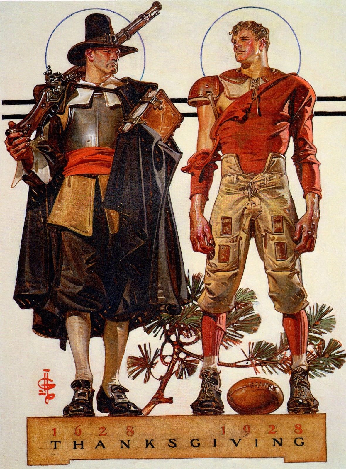
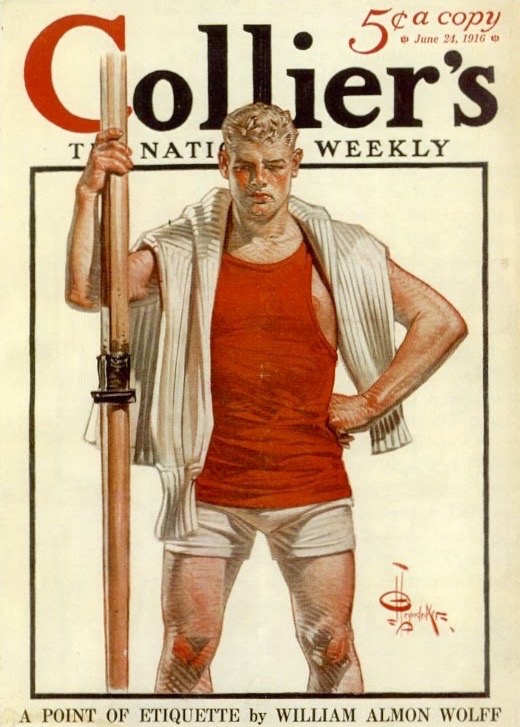
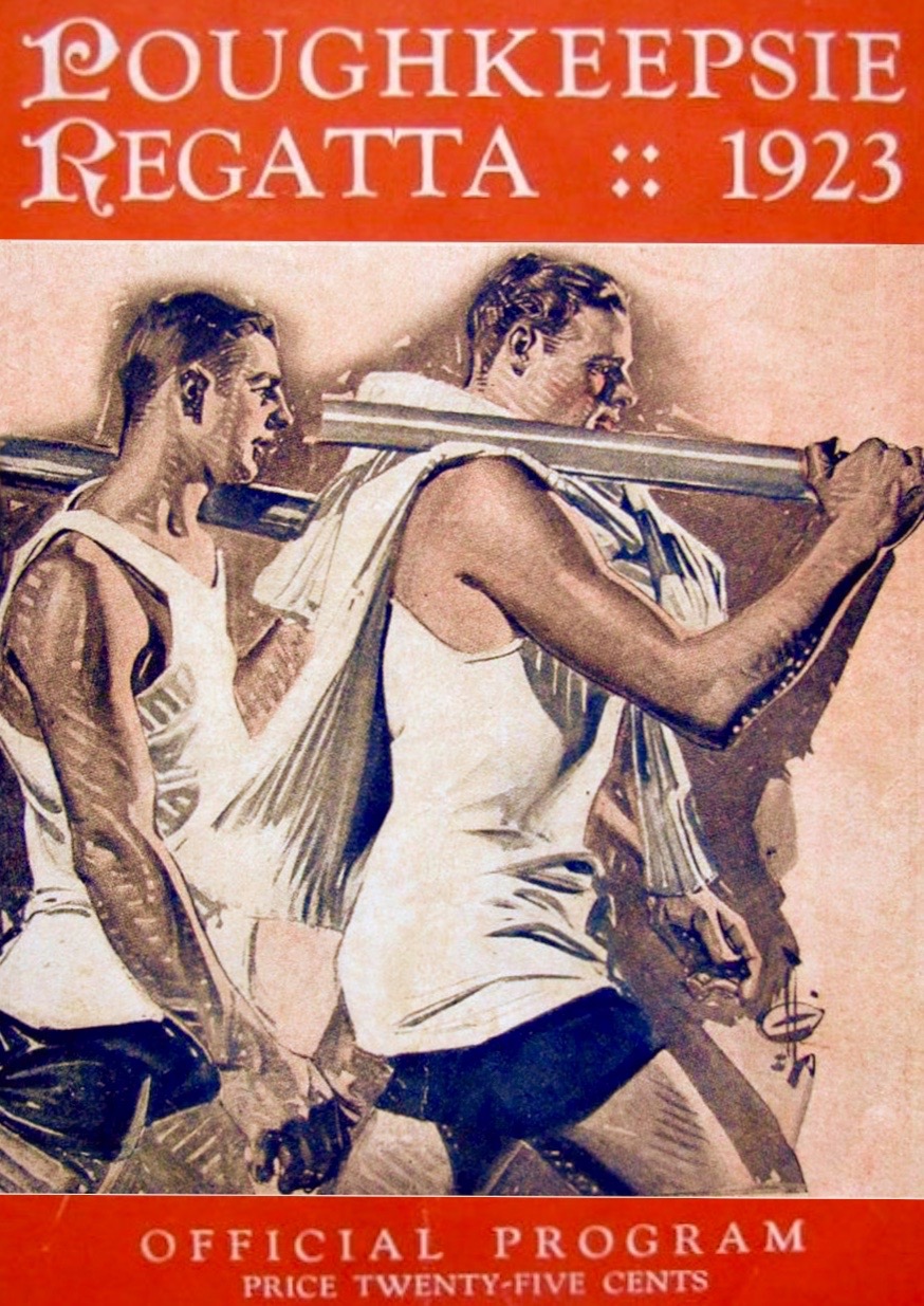
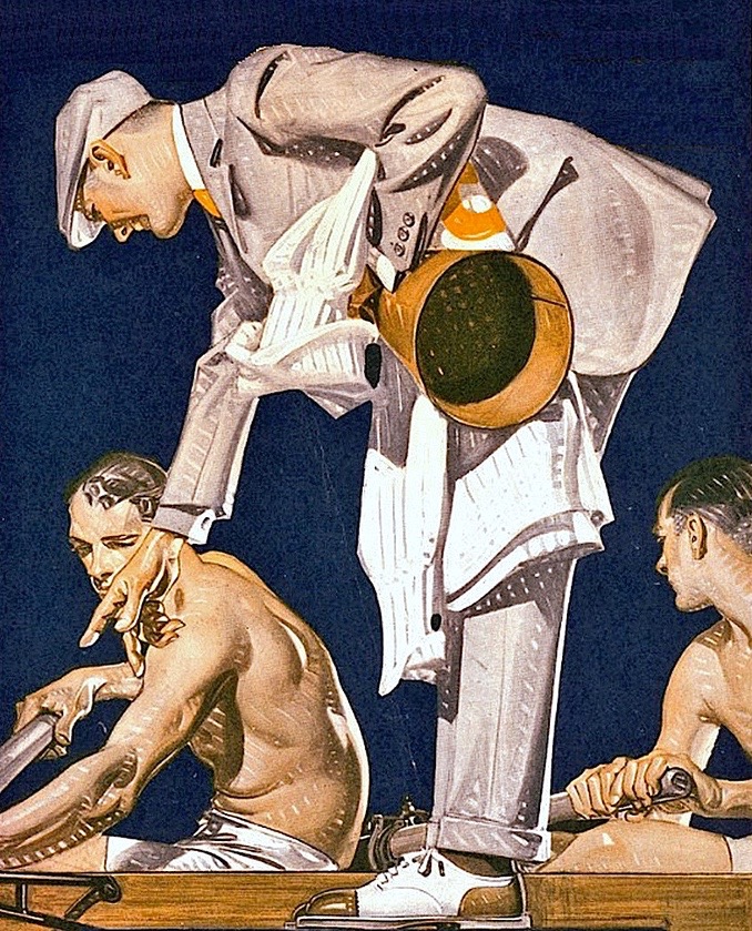
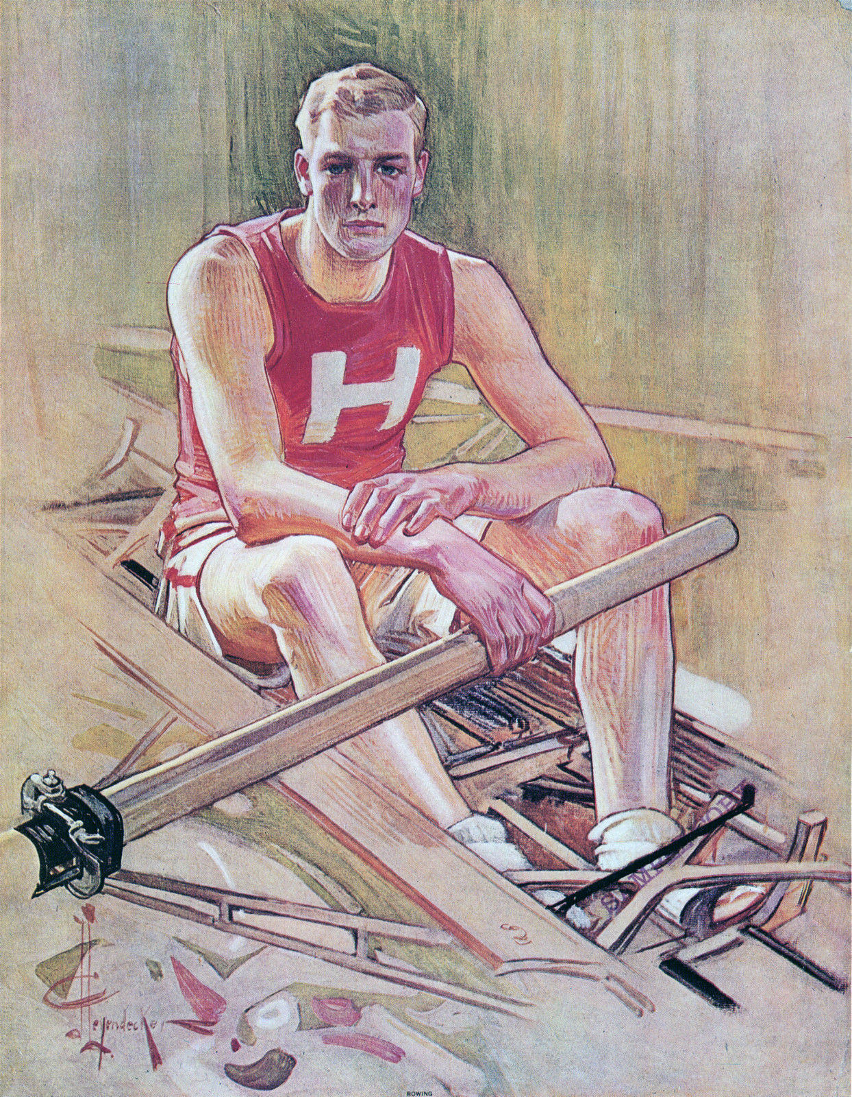
Unlike Rockwell’s celebration of traditional family values, Leyendecker’s two hyper-masculine, square-jawed, all-American icons of Thanksgiving, a Puritan and a football player, eye each other like two men cruising a gay nightclub with a strict and peculiar dress code. It also shows Leyendecker’s great technical skill and faultless draftsmanship and is a far more interesting image than Rockwell’s bland (though artistically talented) painting – even if the viewer is not one of Dorothy’s friends. Ultimately however, here in HTBS Land, Rockwell is out of favour because, as far as I know, he only produced one (rather dull) image of an oarsman, while Leyendecker painted at least ten pictures of men made large by the repeated bending of an oar.
Here are some of Leyendecker’s perhaps more obviously homoerotic depictions of rowers.


Alfredo Villanueva-Collado, a former literature professor at the City University of New York and a J.C. Leyendecker collector, has been quoted as saying:
[Leyendecker’s] sportsmen aren’t really competitors. They were an image of the American male as huge and beautiful, but not threatening.
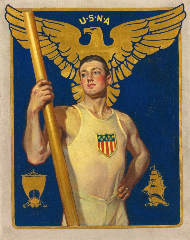
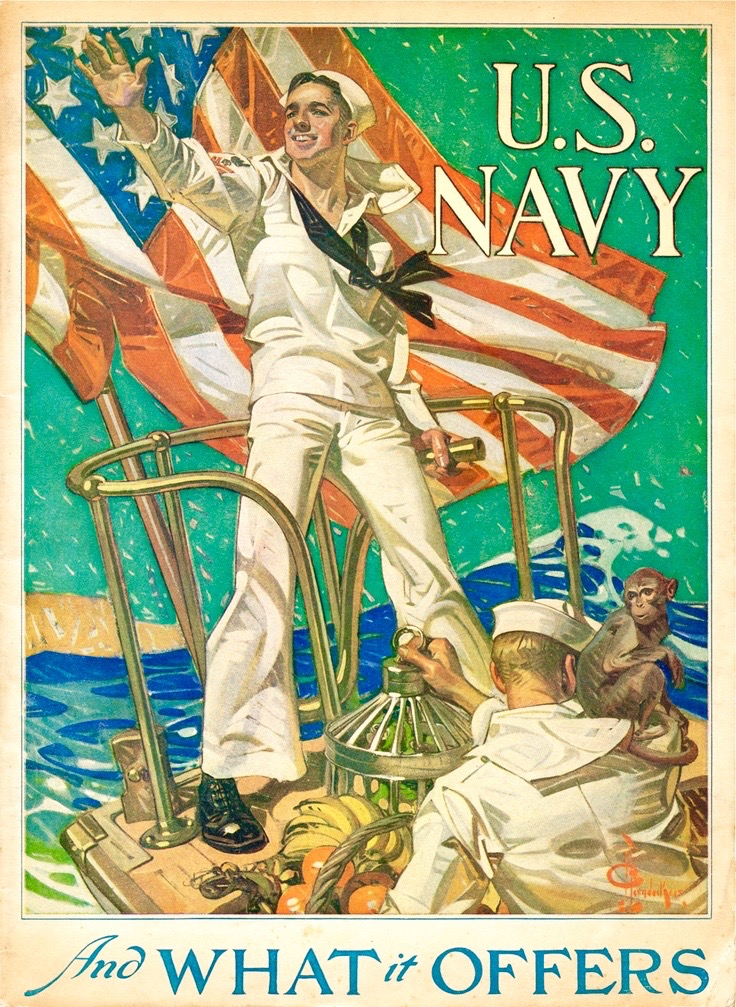
Not all of Leyendecker’s images had a gay subtext, probably not least for commercial reasons. When given free licence to depict sailors, he may have chosen to employ every stereotypical homoerotic image available:
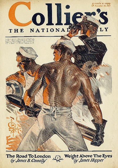
However, when employed by the U.S. Navy to produce a recruiting poster, Leyendecker has to tone it down a bit
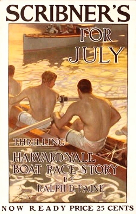
The three examples of apparently ‘unsexualised’ images of oarsman by Leyendecker that I have found are, coincidently or not, all of Harvard men (no comments from Yalies please).


Despite his obvious talent, Leyendecker’s work went out of fashion, money became tight, and he outlived most of his friends. His funeral in 1951 was attended by only five people, including his partner of 50 years, Charles Beach. The four pallbearers were three of his former male models – and Norman Rockwell.

Jane Kingsbury writes: Thanks for this fascinating article, Tim. It was an eye-opener for me!
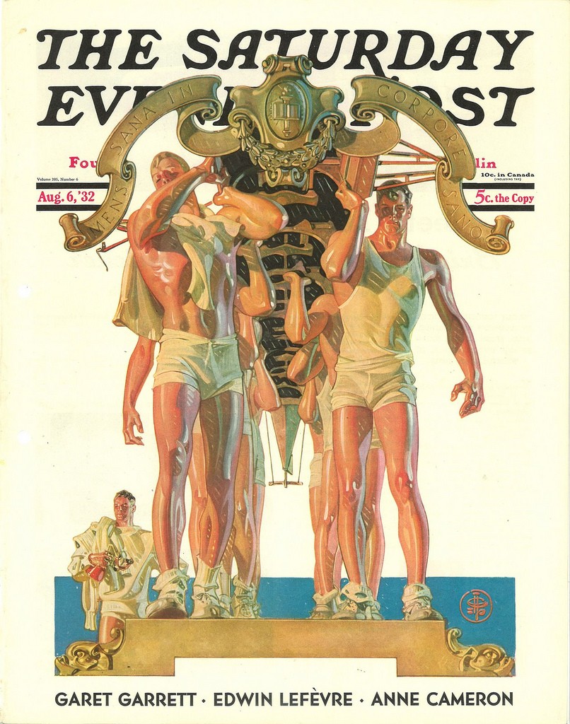
USA won the gold medal in men’s coxed eigths at the 1932 Summer Olympics at the Marine Stadium in Long Beach, California, on August 13, beating Italy by 2/10th of a second. The lead image magazine cover to this article dates to the week before that event. The USA won 4 medals in rowing, 3 of which were gold.
Was there a mistake in the post referencing “Tom of Finland” when it was actually typed “Tim” in the beginning of the article- or am I mistaken?
Hello Andy, No, no mistake. Article writer Tim Koch is only playing with the first names Tim and Tom.
Stumbled on this by accident but glad I did. Fills a gap in most of the other content out there on the subject.